Europe relative to USA
Posted: November 20, 2021 Filed under: maps Leave a comment
Cheers to whoever it was on Twitter that put me on to Scale-A-Tron, latest map overlay tech. My post on how big UK/Ireland are compared to California is one of my most popular.
Here’s some fun with California:

A good comp for Italy, in climate as well as size.
Compared to Korea:

Good reminder on how vast Australia is:

A fellow I met in Brisbane once shook his head about foolish tourist who thought he could drive to Cairns in one day.
Chile:

Namibia:

The US Midwest:

In Best and The Brightest, David Halberstam reports that General Max Taylor introduced a note of ice cold realism by presenting a map of Cuba overlaid over the United States, shaking the stupid assumption that this was a rinkydink little island, invasion of which would be a minor matter:

Maybe they should’ve done this one:

Or:

Tupaiai’s Map
Posted: April 23, 2019 Filed under: islands, maps Leave a comment
After he landed in Tahiti in 1769*, Captain James Cook met an island man, Tupaia, who drew him a map of islands of the South Pacific.
That Cook respected and trusted Tupaia is evidenced by the fact that for an entire month, he let Tupaia navigate his precious ship through the archipelago of the Society Islands, and on southward across open waters to Rurutu in the Austral Group. Tupaia turned out to be an invaluable linguistic and cultural translator for the crew, especially so in Aotearoa/New Zealand, where Cook landed next. Only when the Endeavour reached Australia did Tupaia’s powers to communicate fail; he eventually fell ill and tragically died in Batavia, today’s Jakarta in Indonesia.
Only copies remain, and they’re hard to comprehend:
For almost 250 years, Tupaia’s Map posed a riddle to historians, anthropologists and geographers of the Pacific alike. Until more recently, only a rather small number of islands on the map could be reliably identified. The British on Cook’s ship knew little Tahitian, and their linguistic talent was limited. They wrote down what they heard Tupaia say when he named the islands he drew, in an often very corrupted English transcription. What is more, many of the Tahitian island names are no longer in use in the region. But the more foundational problem is that even those islands which could be identified are hardly where one would expect them according to the logic of a Western map. By the standards of maps in Mercator projection as Cook used and drew them, the islands seem to be all over the place: Islands thousands of kilometers apart appear right next to each other, islands which should be to the south of Tahiti appear in the northern quadrants, small islands can have very large outlines, etc.
To cut a much longer story short: In Tupaia’s cartographic system, avatea marks a bearing to the north. It references the direction of the sun in its highest position at noontime (which south of the tropic of Capricorn, and most of the year south of the equator, points due north). Tupaia thus overrode the cardinal logic the Europeans set up for him: For the islands he subsequently drew, north would no longer be ‘up,’ east ‘right,’ south ‘down,’ west ‘left.’ North would from now on be in the center of the chart. What he thus also overrode is the logic of a singular, central perspective.
In Tupaia’s logic, there is no singular orientation abstracted from the traveller. True to his wayfinding tradition, the center of observation is always the va‘a (canoe). Rather than imaging an aloof bird-eye perspective, Tupaia must have invited his European collaborators to situate themselves in the chart, on a va‘a at any of the islands he subsequently drew.
One can’t help but be reminded of Super Mario Bros. 3, World 4:

* thanks to the many emphatic readers who noted my error (Cook’s voyage reached Tahiti in 1769, not 1767 as originally stated)
Raven Maps
Posted: October 4, 2017 Filed under: America Since 1945, maps Leave a comment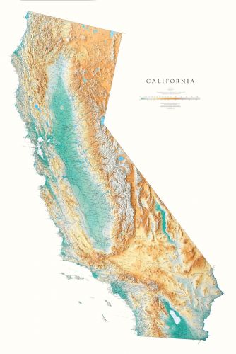
I’ve spoken before of my love of Raven Maps. Shoutout to Professor McHugh for putting me onto them.

Recently I had some correspondence with them. With their permission I share it with you.
Name: Steve Hely
Their Questions or Comments: Hi! Big fan of your maps, have bought several. I was interested in learning some cartography basics so I can make a topo map of a small (five square miles) area of the world I inhabit and love. Do you have or know of any resources for learning these skills! Thanks!
(That’s what I wrote, on their form).
Raven Maps replies:
Steve Hely,
Well, that’s a good question. The old techniques have long-since been reduced to algorithms and interred in software. All maps are now produced digitally, but I assume you want to just enjoy learning your area in the way that mapping it allows? You don’t need to become a GIS / Cartography tech for that.My suggestion: get the printed USGS 1:24,000 scale 1:7.5′ map of your area (perversely, an area you are interested in often turns out to be at the edge of two, or at the corners of two or three, in that case get all the sheets you need), or print them out from an on-line digital source); get tracing paper (or polyester drafting film), and start tracing the features you are particularly interested in– and just keep at it. Many iterations, probably many dozens. That’s OK, tracing paper is cheap. Colored pencils cost more but you won’t need all that many. Remember that every completed map has a great many more layers and classes of features than you probably care about, and probably does not show the ones you DO care about– and that’s where the fun starts, as you figure out what to leave off, how heavy / what color the lines are, how to identify the features you care about, and so on.For an area of 5 miles on a side, differences in projection (among various source maps, which you will probably start consulting) will be only a very minor problem, you can probably ignore. Scale differences can be corrected at your local FedEx copy shop.And always, keep on hand some sample map you especially like, so that you can see how that map handled the particular issue you are wondering how to solve. (There’s a reason you see aspiring painters closely studying the classics in museums– first, learn how THEY did it.)Hope this helps,Stuart AllanRaven Maps

I mean the USGS website is sick. What a beautiful thing we the taxpayers have made.
WARNING TO MASSACHUSETTS DRIVERS!
Posted: August 28, 2017 Filed under: Boston, maps, New England Leave a comment
Discovered a serious error in my DeLorme Atlas & Gazetteer
You can’t actually drive from Moon Island to Long Island! There’s a road on the map that’s just not there!

Be careful out there guys and ALWAYS double check visual clues before attempting to drive from one island to another.
The Ordnance Survey
Posted: March 27, 2017 Filed under: Ireland, maps Leave a comment

A friend is going to Ireland to do some landscape painting. I’m like, amazing. Plus this is a guy who usually gets it with maps. One day I sit down at my desk which has under its top an Ordnance Survey map of the Dingle Peninsula.

And I’m like oh friend make sure you get the Ordnance Survey map for where you’re going!
Why, he says.

Look, the Ordnance Survey Ireland website doesn’t have the smoothest experience.
But the treasures within!

Ordnance Survey Ireland is headquartered in the Phoenix Park.
The origins of the Ordnance Survey lie in the aftermath of the last Jacobite rising which was finally defeated by forces loyal to the government at the Battle of Culloden in 1746. Prince William, Duke of Cumberland realised the British Army did not have a good map of the Scottish Highlands to find the whereabouts of Jacobite dissenters such as Simon Fraser, 11th Lord Lovat so they could be put on trial.

They just missed him here.

You don’t want to have a map that marks every stone row and holy well?

A map that shows the ancient druid stones and the ruined churches like something a wizard would have?

good to have a waterproof map
How big are places compared to other places?
Posted: September 9, 2016 Filed under: Australia, maps, New Zealand, the California Condition, the ocean, the world around us Leave a comment
Traveling across the South Island of New Zealand by train, I was trying to work out for myself how big exactly the country is.

It looked big
With the help of OverlapMaps, here’s a comparison of New Zealand to California:
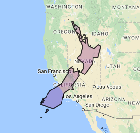
The total land area of New Zealand, says Google, is 103,483 mi²
In US state terms, that makes it just smaller than Colorado, at 104,185 mi².


Colorado has about 1 million more people.
Colorado: 5.356 million (2014)
New Zealand: 4.5 million
Pop wise New Zealand is about the size of Kentucky or Louisiana.

The folks at Brilliant Maps do fantastic work in this field. Here are some of my favorites:
Los Angeles and other cities overlaid on The Netherlands:

Not sure I totally understand what’s going on here.


Map by Chris Stephens, from naturalearthdata.com

Created by: reddit user Tom1099
US in China by population:

How the US population fits into China by reddit user jackblack2323
OR:

Map by reddit user gotrees
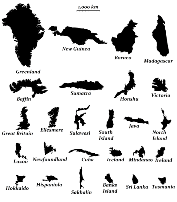
The relative size of the 24 largest islands in the world, map by reddit user evening_raga
And The Circle:

Map created by reddit user valeriepieris
Here’s one more for you, from OverlandMaps:

Australia’s population is 23.13 million or so, so it’s about three million people bigger than Florida (20.2 mill) and smaller than Texas (27.46 mill). Whole lotta room down there. About as many people as Illinois and Pennsylvania put together, in a land area (2.97 million square miles) that’s about as big as 51 Illinoises.

one of Australia’s more densely populated areas.
